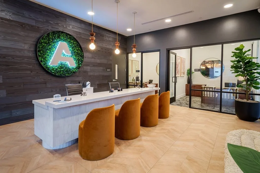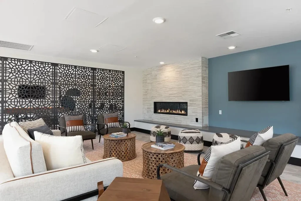

Here’s a quiet truth about student housing marketing: the amenity photos from opening day often get used for years. Every new group of prospective residents scrolls through them before they tour. So the common areas need to look like the photos in year one, in year three and on the day the next cohort walks in.
That means finishes have to be durable, cleanable and photogenic, all at once. It sounds like a contradiction. It isn’t. It just takes careful selection.
Where durability and photos disagree
Some finishes look incredible in a photo shoot and terrible six months later. Others last forever and photograph like a school hallway. The sweet spot is in between.
- High gloss photographs bright and shiny but shows every scratch, smudge and fingerprint.
- Very dark surfaces look dramatic but show dust, scuffs and water spots.
- Very light, solid colors look fresh until the first spill.
- Flat, matte paint hides wall flaws but can be hard to clean without leaving marks.
The goal is finishes with enough texture, pattern and mid-tone color to hide daily life, and enough character to look great on camera.
Our go-to picks by surface
| Surface | What we reach for | What we usually skip |
|---|---|---|
| Floors | Commercial LVT with a strong wear layer, mid-tone wood looks, textured porcelain tile | High-gloss tile, thin wear layers, very dark floors |
| Walls | Scrubbable paint, durable wallcovering, wainscot where chairs hit | Flat paint in high-traffic zones, delicate wallpapers |
| Counters | Quartz, solid surface, high-pressure laminate with a durable edge | Soft stone that stains, thin laminate edges |
| Upholstery | Performance fabrics with texture or pattern, cleanable finishes | Pale solids, loose weaves that snag |
| Tables | High-pressure laminate or solid surface tops, metal bases | Veneer tops that swell, fragile glass |
| Ceilings | Acoustic panels, wood-look slats, simple painted drywall | Delicate decorative ceilings in reachable spots |
None of these choices are exotic. The skill is in combining them so the room still feels designed, not just tough.
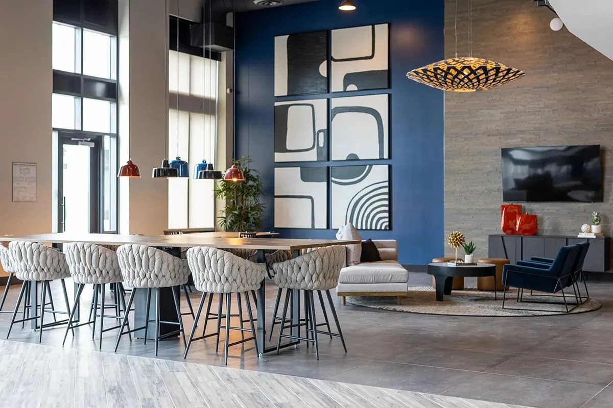
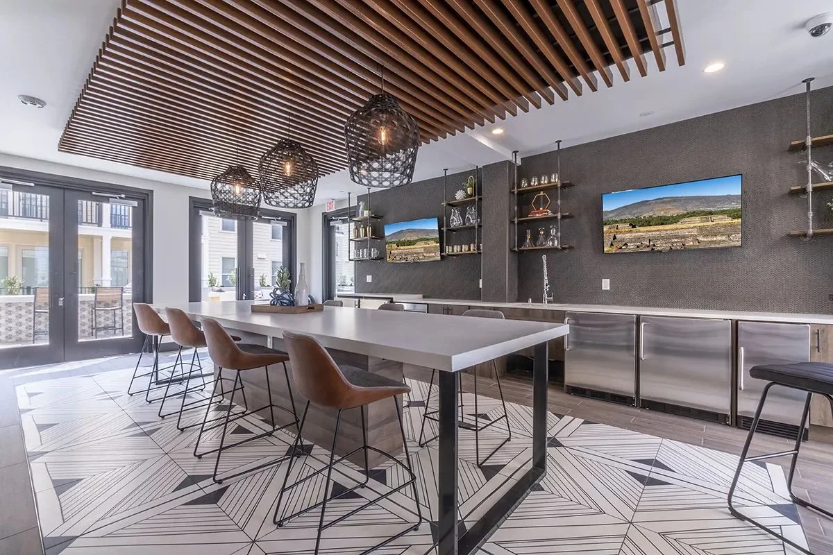
Texture is your best friend
Texture does two things at once. It hides small marks, and it gives photos depth. A lightly textured wallcovering, a patterned rug, a boucle-look performance fabric or a wood-grain floor all photograph with warmth and forgive a lot.
Pattern helps too. Small to medium patterns in carpet tile and upholstery hide spills and wear. The trick is choosing patterns that feel current, not like a hotel conference room.
Color that holds up
Mid-tones are the workhorses. Warm grays, soft greens, earthy blues and wood tones show less wear than stark white or near-black. Then add color where it’s easy to change: accent walls, art, pillows, lighting and a few statement pieces. When the look feels tired in a few years, you refresh the easy stuff and leave the floors and counters alone.
Pick finishes for the tenth month, not the first. The photos will take care of themselves.
Light makes or breaks the photo
Lighting is a finish too, and it matters just as much as the materials.
- Layer light with overhead, wall and table lamps so rooms feel warm at night.
- Choose a consistent color temperature so photos don’t look patchy.
- Light the walls and feature areas, not just the floor.
- Avoid bare downlights in a grid, which make a room feel like an office.
Good lighting also makes durable materials look more expensive than they are. That’s one of our favorite tricks. It’s also the cheapest thing to fix after opening, since a lamp swap costs far less than a new floor.
The cleaning crew test
Before we finalize a finish, we ask a simple question: how does the cleaning crew take care of this, and how long does it take? If the answer involves special products, delicate handling or a lot of time, it’s probably the wrong finish for a student building.
Easy to clean means wipeable surfaces, sealed grout or no grout, fabrics that clean with water, and floors that don’t need waxing.
Easy to repair means attic stock of flooring, wallcovering and fabric, from the same run, so a patch actually matches.
Warm, not institutional
The easy way to make a common area durable is to make it feel like a clinic. Hard surfaces everywhere, bare walls, bright overhead light. It will last, and nobody will want to be there.
Our standard is simple: it should feel like a home, not a facility. Durability comes from better selection. The room should look like a great living room that happens to be built for a hard year.
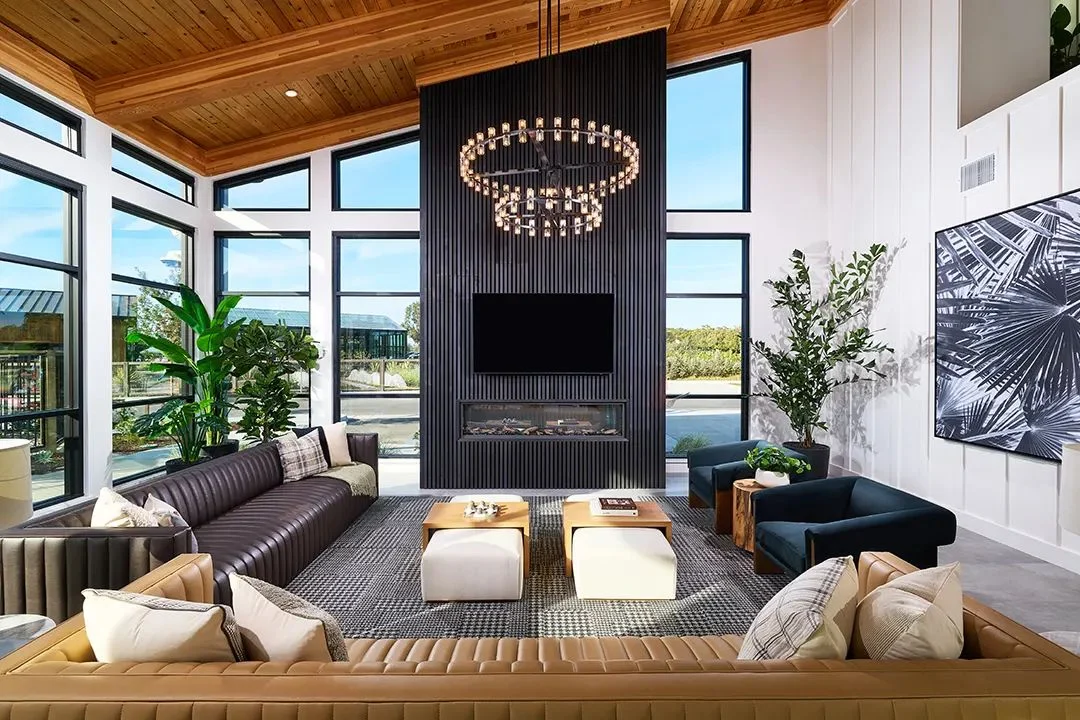
With 88 awards across our work, we’ve learned that the photos that win people over come from rooms designed to last, not rooms designed for the shoot.
We love seeing a common room in year three that still matches its opening-day photos. That’s the best before-and-after there is.