

Picture a hospital corridor. Same doors, same flooring, same light, same color, and a sign every few doors with arrows and room numbers. It works, sort of. It also makes everyone who walks it feel like a visitor.
Senior communities need to be easier to navigate than a hospital, not harder, and they need to feel nothing like one. The good news is that the best wayfinding tools are interior design tools. Signs are the backup, not the plan.
Why wayfinding matters more here
Residents in senior living find their way with changing vision, hearing, energy and sometimes memory. Getting lost isn’t just an inconvenience. It can be embarrassing and frightening, and it’s one reason some residents quietly stop leaving their apartments. When residents skip meals and activities, everything else about the community gets harder.
For operations, poor wayfinding means staff time spent escorting, redirecting and answering the same question again and again. That’s labor on every shift, for the life of the building.
The toolkit, from most to least powerful
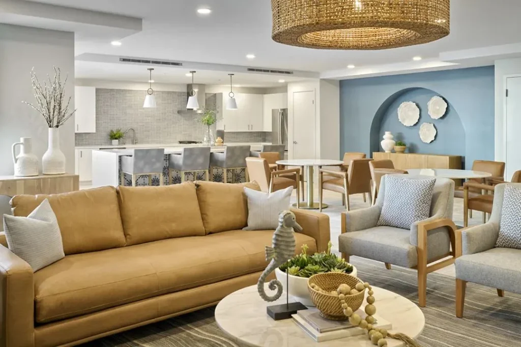
1. Landmarks. People navigate by memorable things, not room numbers. A big piece of art at the corridor turn. A fireplace in the lounge. A bright bookcase by the elevator. The piano, the aquarium, the armchair by the window with the view. Put a strong landmark at every decision point, anywhere a resident has to choose which way to go.
2. A simple plan. Short corridors, clear loops and destinations you can see from where you stand. Some of this is architecture, which is why we like being involved early. A corridor that dead-ends is a wayfinding problem no sign can solve.
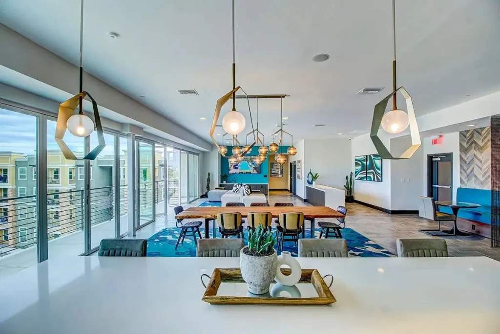
3. Destinations you can see. When a resident can see into the dining room or lounge from the corridor, through a wide opening or glass, they don’t need directions. They just walk toward the life.
4. Character by zone. Give each wing or floor its own personality: a color family, a type of art, a lighting style, a material. Not the primary colors of a daycare. Subtle, grown-up differences that still register. “I live on the floor with the garden photographs” is a lot easier to hold onto than “I live in 3 West.”
5. Personal cues at the apartment door. A small shelf or shadow box beside each entry lets residents display something of their own. It helps them find home, and it gives neighbors something to talk about. It’s one of our favorite details in any senior building.
6. Signage. Clear, well lit, readable, mounted at a comfortable height and consistent throughout. Signs should confirm what the building already told you.
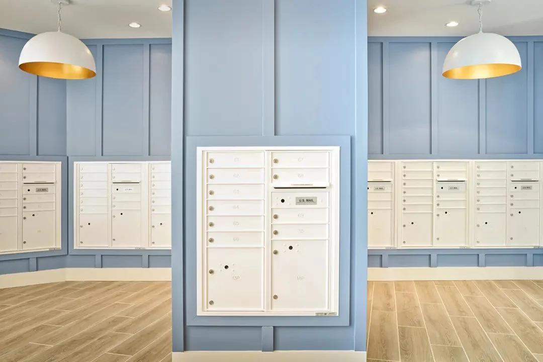
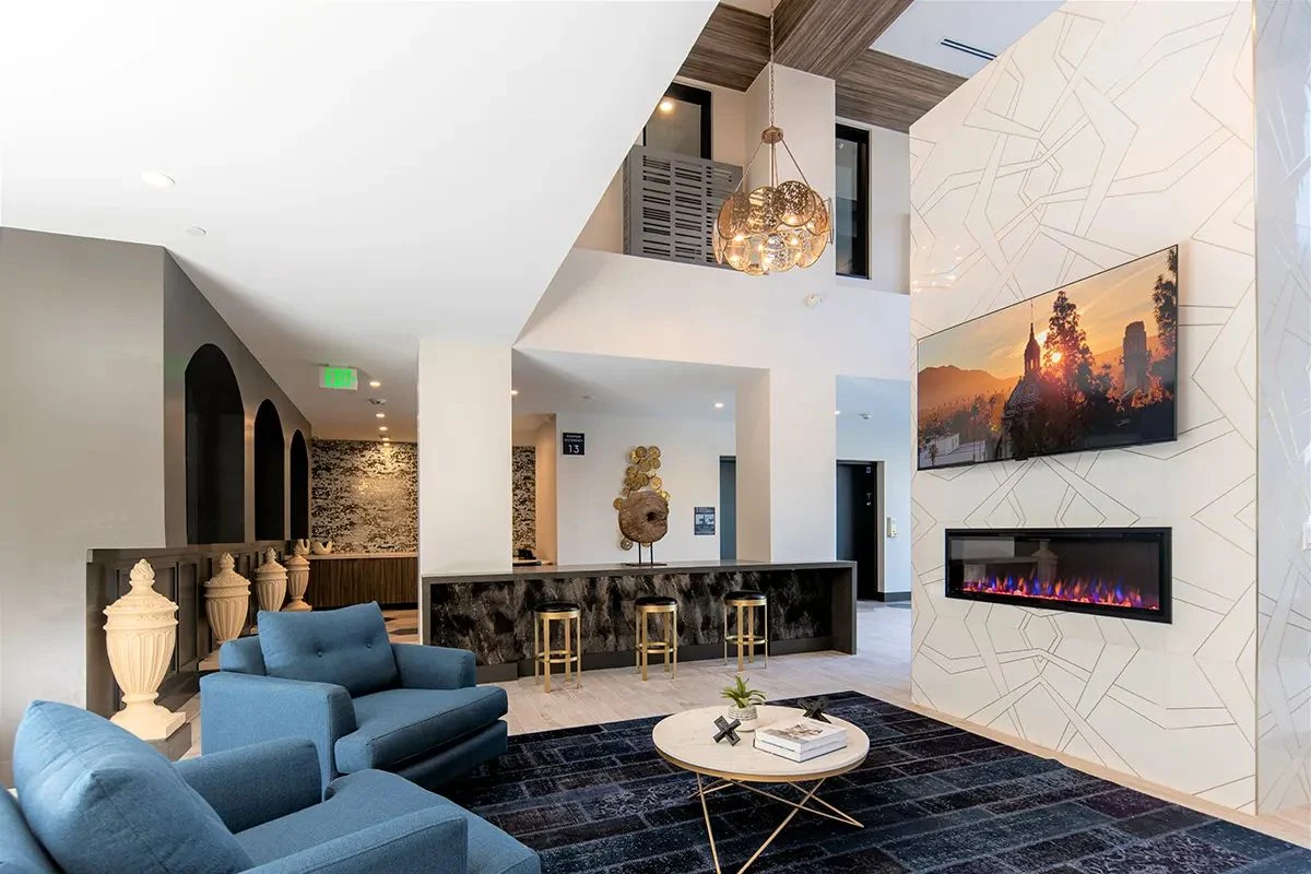
Good wayfinding means the building does the pointing, and the signs just nod along.
Signs that don’t feel clinical
When you do need signs, and you will, a few rules keep them feeling like home:
| Hospital style | Home style |
|---|---|
| Arrows and paper notices everywhere | A small number of framed, consistent signs |
| Cold white with blue text | Warm, high-contrast color pairs that fit the palette |
| Names like “Multipurpose Room B” | Names people actually say: the Library, the Garden Room |
| Signs wherever there’s empty wall | Signs at decision points, with a landmark nearby |
| Notices taped to doors | A real activity board in a spot people pass every day |
That last one matters more than it looks. A community board with the day’s schedule, the menu and a few photos gives residents a reason to pause, and gives staff one place to post everything instead of a hundred little notes.
Memory care is its own design problem
In memory care, wayfinding shifts from “find anything” to “find the few places that matter”: your room, the restroom, your seat at the table and the way outdoors. We keep the household small and looping where the plan allows, make the restroom door easy to spot, give each apartment entry a personal display and use contrast to pull the eye toward the right places.
What we play down matters just as much. Staff-only doors can be finished to blend into the surrounding wall so they don’t draw attention. Your care team and code consultant set the rules on doors and exits. We make those rules feel natural instead of locked down.
Where the plan helps (or hurts)
A few layout moves make wayfinding almost automatic:
- Place the dining room, mail and main lounge along one central path
- End every corridor at something worth walking toward, like a window seat or a small lounge
- Keep the elevator lobby distinct on each floor, so residents know when they’ve arrived
- Put a place to sit and rest at regular intervals along longer routes
Each of those is easy at schematic design and awkward after the walls are framed.
Three questions to ask on any plan
- Standing at each decision point, what’s the landmark?
- From each corridor, can you see where people gather?
- Could a resident describe the way to their apartment without using a number?
If the answers are fuzzy, fix them now. In our experience, a change that costs about $1 at schematic design costs about $25 to $50 once construction is underway.
We’ve been designing senior spaces since 1995, and a resident walking to lunch without a second thought is still one of our favorite sights.