
Here’s a scene every senior living sales director knows. A daughter drives in on a Saturday with her dad in the passenger seat, not especially thrilled about the outing. She has a short list of communities, a long drive home and a notes app full of questions.
She’s not really looking at the chandelier. She’s asking herself three things:
- Will Dad be safe here?
- Will Dad be happy here?
- Will I feel okay about this when I’m driving home tonight?
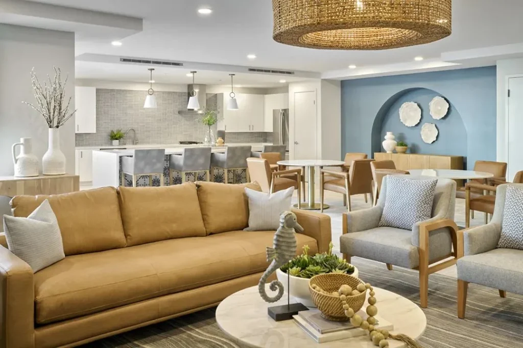
The interiors answer all three before anyone hands her a brochure.
Two people, one tour
The adult child and the future resident often want different things. The resident wants to know if they’ll still be themselves here: their routines, their friends, their dignity. The adult child wants reassurance that someone is paying attention, that the place is clean and well run, and that the support is real.
Good design satisfies both at once. Weak design picks one. A building that shouts “safety” makes the resident feel like a patient. A building that’s all resort polish can leave the adult child wondering where the care is hiding.
What adult children notice (whether they say it or not)
The first ten steps. The entry sets the verdict. Is there a warm place to sit? Does someone greet you? Is it bright without glare? Does it smell like a home?
Upkeep. Worn fabric, scuffed corners and chipped table edges read as neglect, even when the care is excellent. This is where durable selection pays off in sales, not just in maintenance.
Signs of life. Residents in the lounge. An activity board with real plans on it. A puzzle half finished on the table. Perfect empty rooms make people nervous.
Quiet support. Handrails, chair arms, good light, easy-to-read signs. Adult children notice these, and they want them to feel like part of the house, not like equipment.
The apartment. They are picturing their parent’s furniture in it. Does the layout fit a favorite recliner and a bed? Is there good light by the chair where Dad will read the paper?
Dining. Meals are the rhythm of the day. A dining room that feels like a nice neighborhood restaurant, plus a private room for family visits, does a lot of selling.

On every tour, the adult child is quietly asking one question: would I feel good leaving my parent here?
The tour path is a design problem
Most communities have a tour route, even if nobody drew it on purpose. We like to design it on purpose.
| Tour stop | What it should say | Design moves that help |
|---|---|---|
| Entry and lobby | You’re welcome here | A warm seating group, lamp light, a real reception moment |
| Main lounge | People live full lives here | Several seating areas, residents visible, books and games in use |
| Dining | Meals are something to look forward to | Restaurant feel, varied seating, a private dining room for families |
| Corridor | This place is calm and easy to get around | Even light, handrails that read as trim, clear landmarks |
| Model apartment | You can picture your life here | Real furniture layouts, good reading light, storage that makes sense |
| Outdoor space | There’s fresh air and a reason to go outside | Shade, stable seating, a path that loops back |
Operators sometimes skip the model apartment or furnish it at the last minute with whatever’s in storage. It’s one of the hardest-working rooms in the building. That’s where the parent pictures their own life, and where the adult child stops worrying about the logistics of the move.
Don’t design for the tour only
There’s a trap here. A building designed only to win tours can end up as a stage set: gorgeous lobby, tired everything else. Residents live in the whole building, and families keep visiting after move-in. The random weekday visit in month eight matters just as much as the first tour, because that’s when a family decides whether to recommend the place to friends.
So we design the tour route to show off and the rest of the building to hold up. Same standard everywhere a family might wander, including the laundry and the hallway outside the apartment.
A note on memory care tours
Memory care tours are emotional. The adult child is often exhausted and carrying some guilt. Here, calm is the message. Uncluttered rooms, soft even light, familiar furniture, a kitchen that looks like a real kitchen and an outdoor space that’s clearly secure without looking like a fence line. Reassurance comes from how peaceful the space feels, not from how much equipment is on display.
It also helps to give families a place to be. A comfortable corner where a daughter can sit with her mother and share a cup of tea says more about the community than any brochure.
What this means for operations
Designing for the family also shapes how staff work. A lobby where the concierge can see the front door and the lounge makes greeting easy. A private dining room that books easily gives the sales team a place to host lunch with prospective families. Durable, cleanable finishes keep the tour route looking fresh without constant touch-ups. The family sees warmth. The team gets a building that’s easier to run.
After 1,500 projects, we still think the best compliment a community can get is a family forgetting, for a moment, that they’re touring a senior building at all.