
Aging in place sounds like a big idea. In practice, it’s mostly small ones. Can a resident see the edge of the step? Can she tell where the floor ends and the wall begins? Does the rug grab his walker? Is the path to the bathroom lit at 2 a.m.?
Lighting, contrast and flooring carry a surprising share of that load. They work as a team, and when one falls short the other two have to work harder. Here’s how we approach each one. Your architect and code consultants own compliance. Our job is to make all of it feel like home.
Lighting: even, layered and kind to the eyes
We have a whole article on lighting for older eyes, so here’s the short version. As people age, their eyes need more light to pick out detail and take longer to adjust between bright and dim. That turns some very common design moves into problems:
- A sunny lobby opening onto a dim corridor
- A single pendant over a table with shadows everywhere else
- Downlights that make a pool of light, then a patch of dark, then another pool
- Afternoon sun bouncing off a glossy floor
The fix is consistency. Light the walking path evenly, soften the change between rooms and layer ambient light with lamps and sconces so no one ends up working in their own shadow. Low night lighting in apartments, from the bed to the bathroom, is one of the kindest details in the whole building.
Contrast: helping people read the room
Contrast is how people find edges. It tells a resident where the seat of the chair is, where the counter stops and where the step begins. With age, low-contrast edges usually get harder to pick out, and beige-on-beige becomes a guessing game.
We use contrast in specific places, not everywhere:
| Where | What we do |
|---|---|
| Floor to wall | A base or wall tone that clearly reads against the floor |
| Seating | Upholstery that stands apart from the floor so the seat is easy to find |
| Counters and tables | A top or edge that differs from the base below it |
| Doors | Frames or doors that read against the wall, especially apartment and restroom doors |
| Bathrooms | Fixtures, grab bars and towels that stand out from tile |
| Handrails | A rail tone that reads clearly against the wall behind it |
The trick is to use contrast as information and keep everything else calm. A room with strong contrast everywhere feels busy and tiring. A room with contrast only where it counts feels easy.
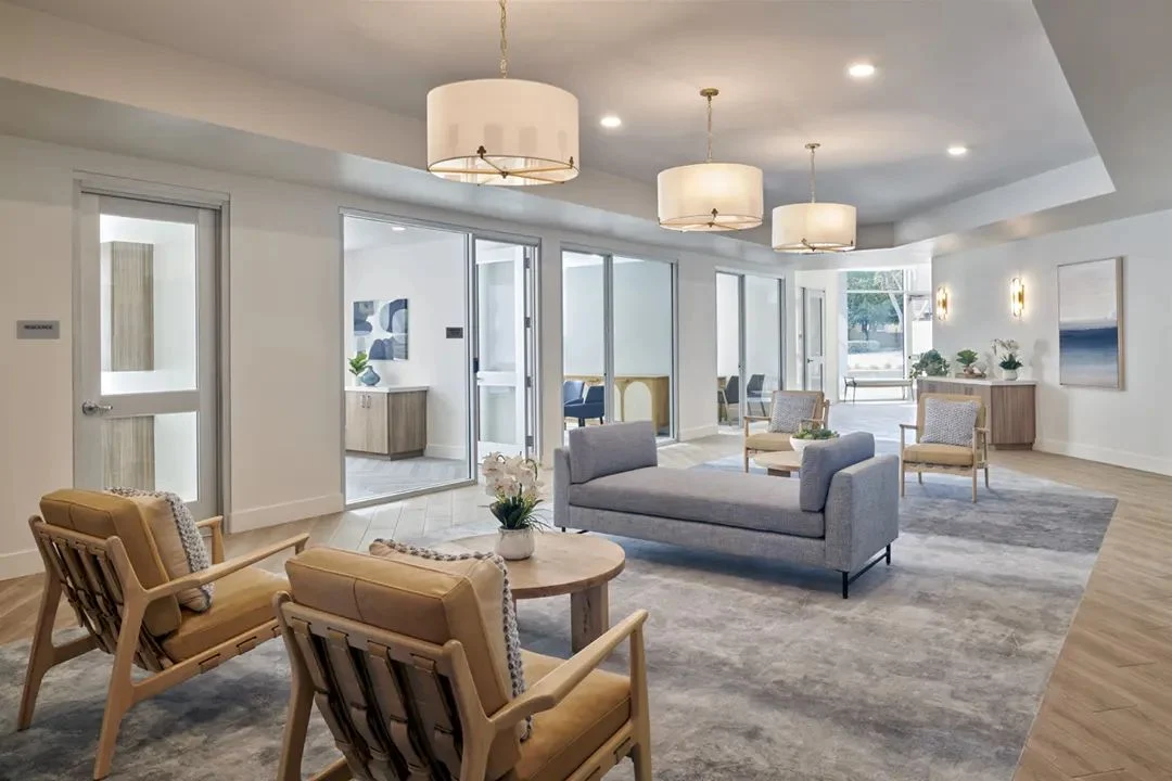
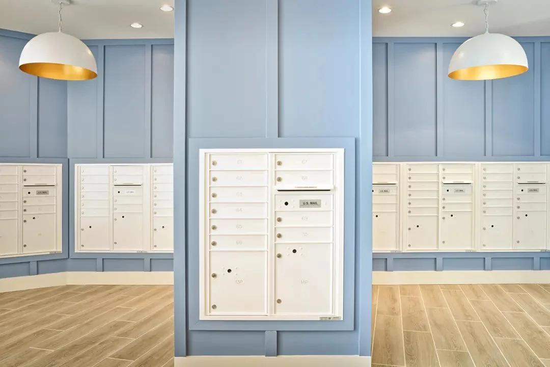
Flooring: calm, matte and consistent
Flooring is the detail most tied to falls, which makes it the one operations and care leadership ask about first. We look at five things.
Pattern. Strong patterns, dark borders and busy geometrics can read as steps, holes or objects to someone with changing vision or memory. In memory care especially, a dark rug or a black threshold can look like a gap in the floor. Keep patterns quiet in walking paths and save the personality for walls and furniture.
Sheen. Glossy floors throw glare and can look wet even when they’re dry. Matte finishes read as solid and stable.
Transitions. Changes in material should be flush and visually gentle. A sharp color change at a doorway can make people hesitate or step high.
Softness underfoot. Carpet and cushioned products feel warmer and are quieter, but they add rolling resistance for walkers and wheelchairs. We match the product to how each area is used: firmer in corridors and dining, softer where people sit and stay.
Cleanability. Senior buildings deal with spills and incontinence. The floor has to clean up without a fight, or it gets replaced early. That’s a year-four cost decision hiding inside a design decision.
The best aging-in-place details are the ones nobody notices, because nobody trips.
Why this belongs early in design
Here’s the practical part. Lighting depends on ceiling plans and circuiting. Flooring depends on subfloor prep, transitions and budget. Contrast depends on coordinating finishes across several trades. All three are cheap to get right on paper and expensive to fix later. Swapping a flooring selection at design might cost about $3,000 in coordination. The same swap with the sub already on site can run about $45,000.
How it shifts by level of care
- Independent living: Good lighting and contrast, quietly done. Residents want a home, not a reminder that they’re getting older.
- Assisted living: More deliberate contrast, steadier lighting and firmer floors in the main paths.
- Memory care: The calmest floors, the most consistent light and very intentional contrast at the things residents need to find, like the restroom door and their chair at the table.
Trade-offs we help teams work through
- The designer loves a dramatic dark floor. Care leadership worries about falls. There’s almost always a mid-tone that satisfies both.
- Housekeeping wants hard surfaces everywhere. Residents want warmth and quiet. A mix by zone usually settles it.
- The budget wants one flooring product for the whole building. The building usually needs two or three, chosen by use.
- Marketing wants a bright white lobby. Aging eyes want less glare. Warm, matte whites and good shading keep it fresh without the squint.
Over 31 years we’ve learned that independence is mostly built out of small, well-placed decisions.