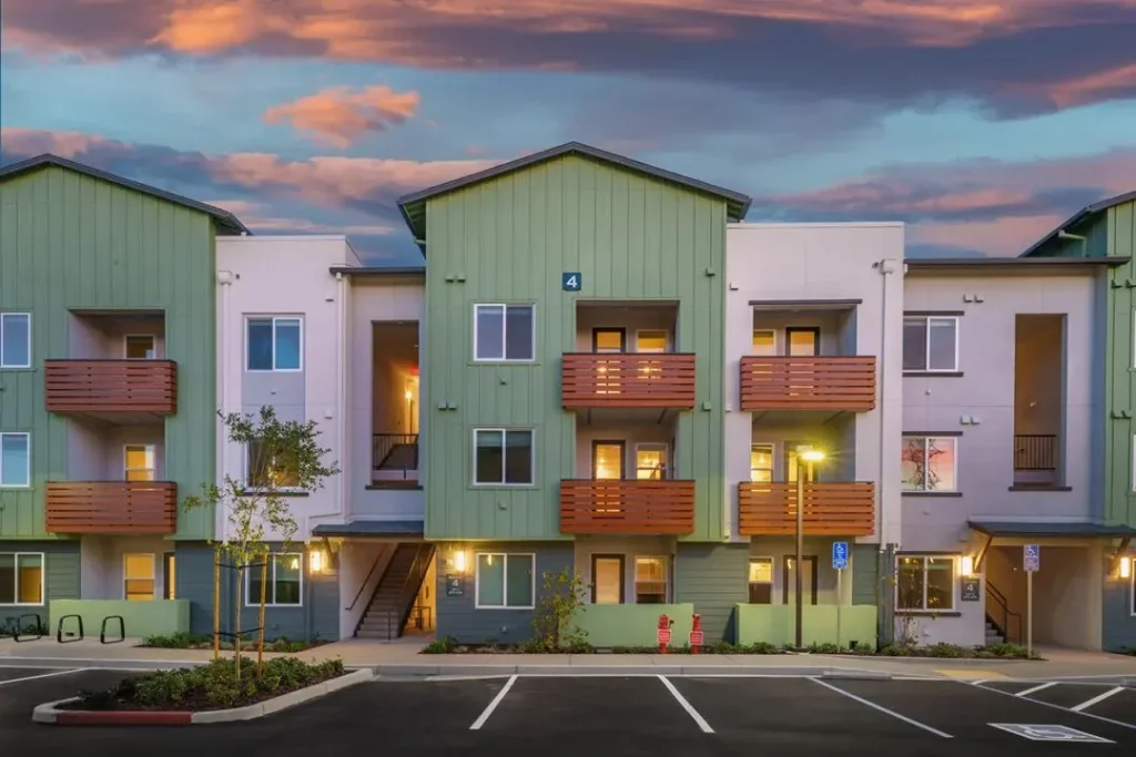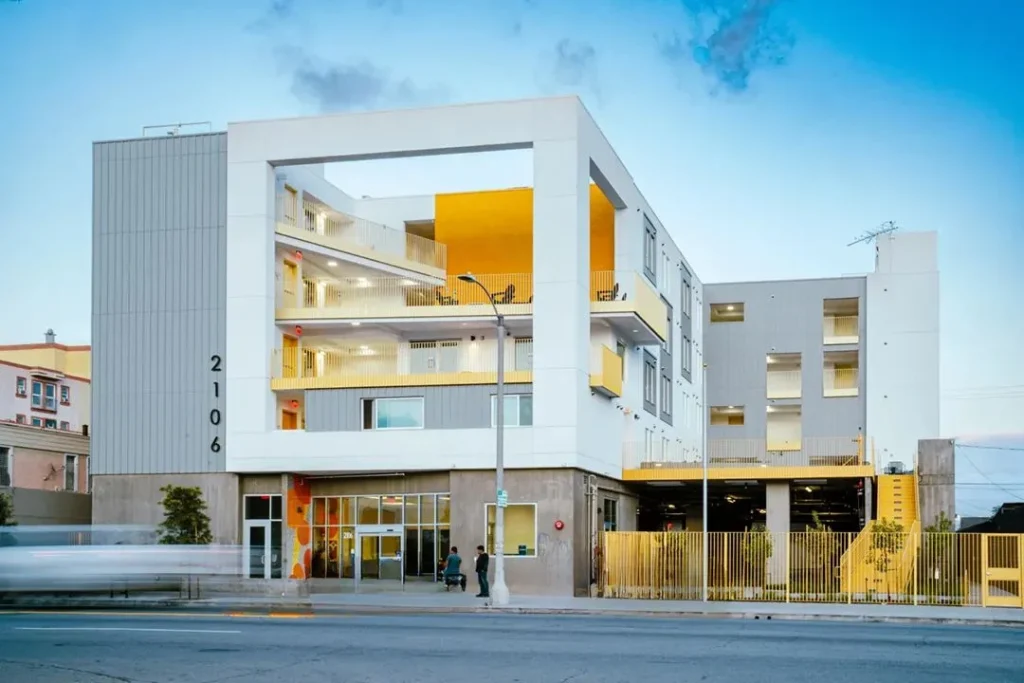

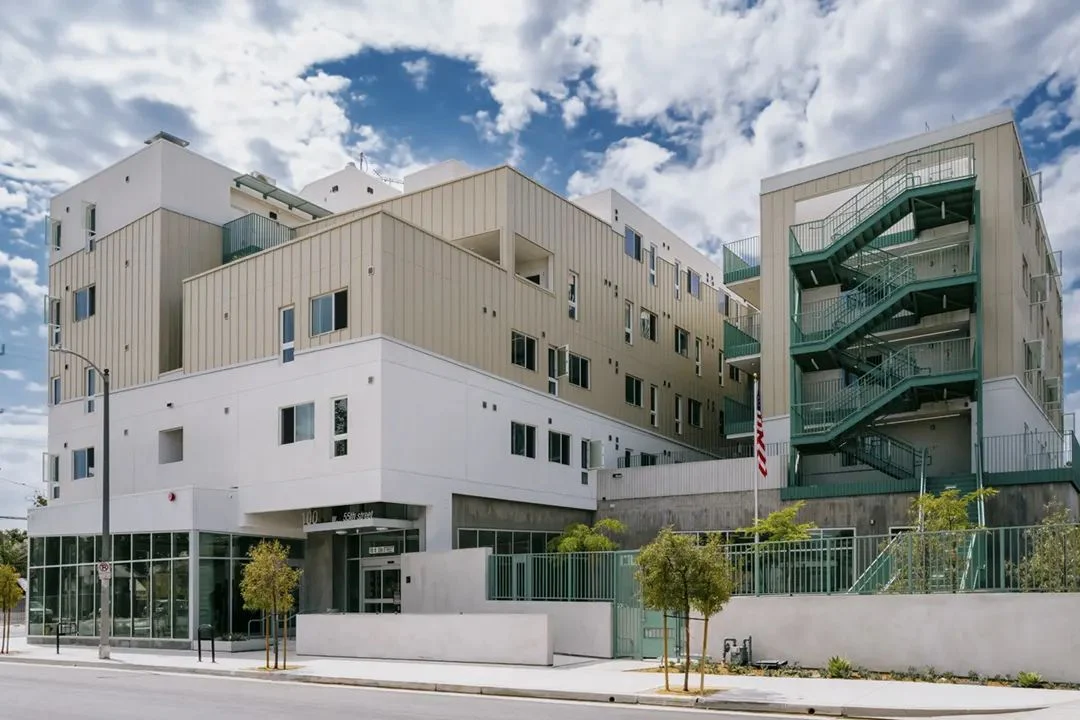
That three-second reaction is the whole game in affordable housing. Residents feel it every time they walk through the door. Prospective tenants feel it on tour. The city council feels it at the ribbon cutting. And the neighbors who fought the project at the planning hearing definitely feel it.
Our rule at Catalina is simple: affordable housing should read as a home, not a facility. Budget pressure makes institutional product tempting. We think durability gets solved through better selection, not by making a lobby look like the DMV.
What “institutional” actually looks like
You have seen it. Maybe you’ve even approved it on a tight budget day. The usual suspects:
- Cool white overhead lighting in every room, with nothing at eye level.
- One flooring material from the front door to the trash room.
- Chairs lined up against the walls like a waiting room.
- Beige walls, beige furniture, beige everything.
- Paper notices taped to the walls because nobody planned a place for them.
- A big empty lobby that nobody lingers in.
None of these choices is wrong on its own. Put together, they tell residents “you are being processed,” not “welcome home.”
Seven moves that make it feel like home
The good news: a home feel is mostly about decisions, not dollars. Here’s what we lean on.
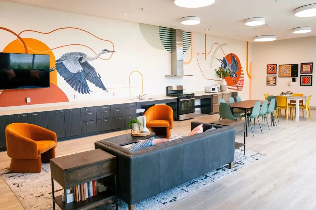
1. Light at eye level. Overhead light alone feels like an office. Add table lamps, wall sconces and pendants over seating. Keep the color temperature warm. It’s the single cheapest way to change how a room feels.
2. Furniture in conversations, not rows. Group seating so people face each other. A sofa, two chairs and a coffee table on a rug says “living room.” Eight chairs against a wall says “please take a number.”
3. Rugs that define zones. A big open lobby feels cold. Rugs break it into smaller spaces people actually want to sit in, and commercial-grade rugs hold up fine.
4. Materials that look like home but are built commercial. Luxury vinyl flooring that reads like wood. Performance fabrics that look like linen and clean like a raincoat. Solid-surface tops that look like stone. This is where durability and warmth stop fighting.
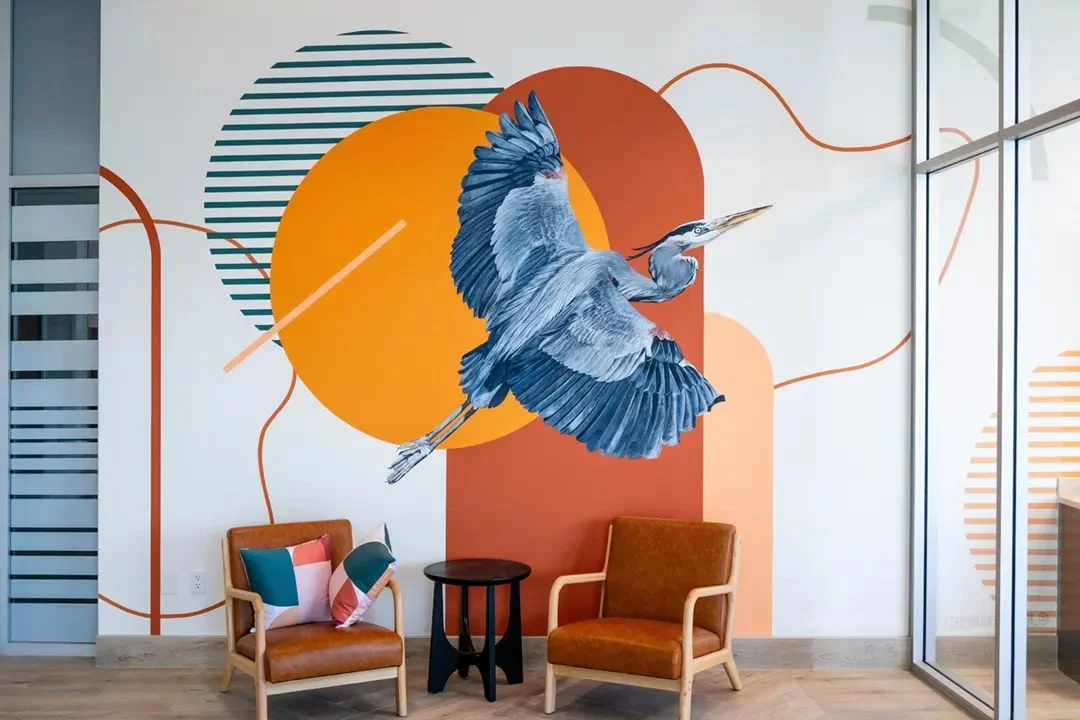
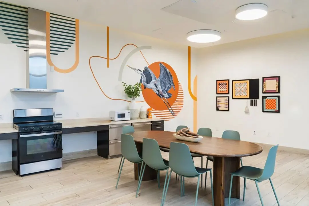
5. Color with a point of view. Not loud, just intentional. A palette tied to the neighborhood or the building’s story gives residents something to be proud of.
6. Art that belongs there. Local scenes, local history, local artists when the budget allows. Art that says “this is our neighborhood” beats generic hotel art every time.
7. A planned home for the everyday stuff. A designed community board. A spot for package pickup. Hooks by the door of the community room. When everyday items have a place, the building stays tidy without anyone trying.
“Won’t home-like finishes get destroyed?”
Fair question, and the most common one we hear. The answer is no, as long as you choose well. The look and the durability are two separate decisions. You choose the look that feels like home. Then you choose the version of that look built for heavy use.
| The look | The durable version |
|---|---|
| Wood floors | Commercial LVT with a wood visual |
| Upholstered sofa | Performance fabric, removable cushions, commercial frame |
| Stone counters | Solid surface, or quartz where people touch it most |
| Painted walls | Eggshell or satin sheen that scrubs clean |
| Soft area rug | Commercial rug with a stain-resistant fiber |
That’s the whole secret. It isn’t expensive. It just takes someone who knows the product lines.
Why it matters beyond looking nice
We could argue this on dignity alone, and that would be enough. But there are hard-nosed reasons too.
- Residents take care of places that feel like theirs. In our experience, well-loved rooms get used and respected. Cold rooms get ignored.
- Leasing moves faster. Even with waiting lists, lease-up goes smoother when tours feel good and the building photographs well.
- Your reputation rides on it. The next project in the next city gets judged by photos of this one.
- Neighbors notice. A building that looks like a home makes the next approval a little easier.
Where to spend when the budget is tight
- The lobby. It’s the first impression for everyone, every day.
- Lighting in common areas. Lamps and sconces change a room for very little money.
- The community room. It’s where the building becomes a community.
- The unit finishes and leasing office. They set expectations for everything else.
The short version
- Residents, prospects and neighbors judge the building in about three seconds.
- A home feel comes from lighting, layout, materials and a little personality.
- Durability is a separate decision: pick the home look, then pick the heavy-duty version of it.
After 31 years and more than 1,000,000 happy residents, we are convinced of one thing: people deserve to come home to a home.
Our question for youWhat’s the one space in your building you’d most like to feel less like a facility?