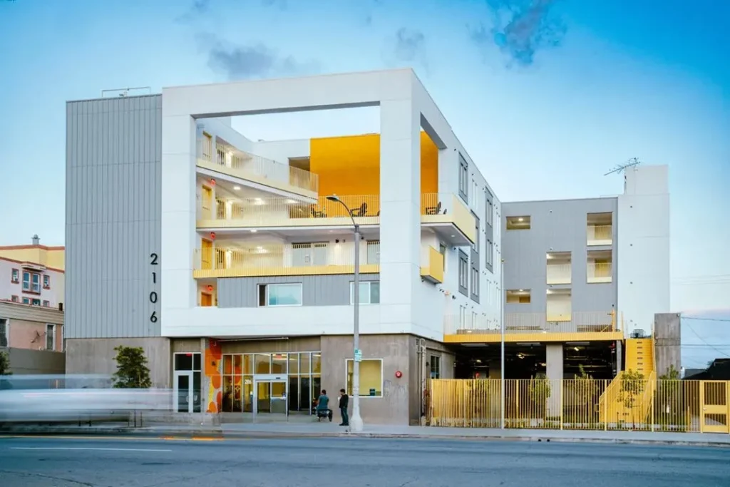

Affordable housing serves more residents with disabilities than almost any other product type, and the accessibility requirements are higher to match. Many developers treat those requirements as a checklist to survive. We think of them as a design brief: make a building that works for every resident without anyone feeling singled out.
A quick note before we start. Your architect and accessibility consultant own the code compliance. Our job as interior designers is to make every accessible choice feel like home, warm and dignified.
The requirements, in plain terms
Projects with federal funding fall under Section 504, which calls for at least 5 percent of units to be accessible for residents with mobility disabilities and another 2 percent for residents with hearing or vision disabilities. Many states ask for more. California’s tax credit program, for example, sets higher percentages for new construction.
The details change by funding source and by year, so confirm the current rules with your team early. What doesn’t change is this: those accessible units and every common area need to feel as good as everything else in the building.
Where interior design makes the biggest difference
Contrast. Residents with low vision rely on contrast to read a space. A floor that contrasts with the walls, a counter edge that stands out from the cabinet, a door frame that reads against the wall. These are color choices, not extra costs.
Lighting. Even, glare-free light helps everyone and helps older eyes most. Layer overhead light with lamps and sconces, and avoid shiny floors that throw glare back at people.
Reach. Controls, hooks, mail slots and shelves need to sit within comfortable reach. The ADA’s reach range runs from about 15 to 48 inches off the floor, and good design puts the things people use most right in the middle of it.
Hardware. Lever handles and D-shaped pulls work for everyone, including anyone carrying groceries or a toddler.
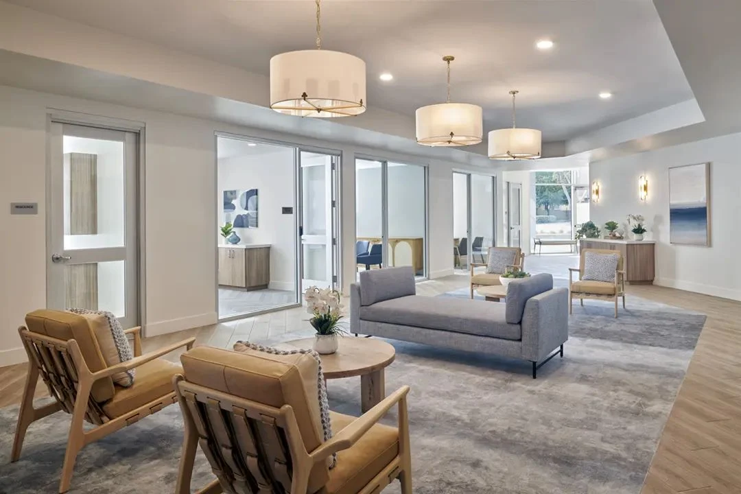
Seating. Offer a mix of seat heights, and give many chairs arms to push up from. Leave open spots beside sofas and at tables where a wheelchair can pull right in.
Flooring. Smooth transitions, inset rugs vs. thick area rugs where chairs roll, and firm surfaces in the paths people travel.
Units for residents with hearing or vision disabilities
Communication-accessible units need visual alarms and visual doorbell signals, and they benefit from thoughtful lighting and contrast throughout. Coordinate these early with the electrical design so the devices land in sensible spots instead of the middle of a feature wall.
Make accessible feel like home
The goal is simple: nobody should be able to walk into an accessible unit and think “this is the accessible one.” A few ways we get there:
| Instead of | Try |
|---|---|
| Stainless hospital grab bars | Grab bars in finishes that match the bath accessories |
| A shower with a big curb and a transfer seat bolted on | A curb-less shower with a fold-down seat in a matching finish |
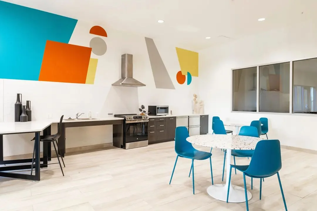
| A lowered counter that looks like an afterthought | A work surface designed as part of the kitchen from day one |
| Signage that looks like a clinic | Wayfinding with warm colors, clear type and a little personality |
Accessibility is easiest and cheapest when it’s designed in from the start, not added after the drawings are done.
Common areas matter just as much
Every resident uses the lobby, the mail area, the community room and the laundry. Clear paths, reachable controls, seating with arms, good contrast and even lighting make those spaces welcoming for residents who use wheelchairs, walkers, canes or strollers. When the common areas work for everyone, the whole building feels like one community.
We’ve designed amenity spaces for more than 1,000,000 residents over 31 years, and some of our favorite rooms are the ones where accessibility is invisible because it just works.