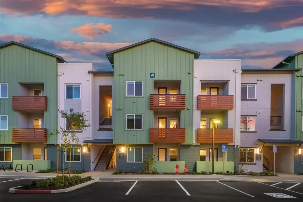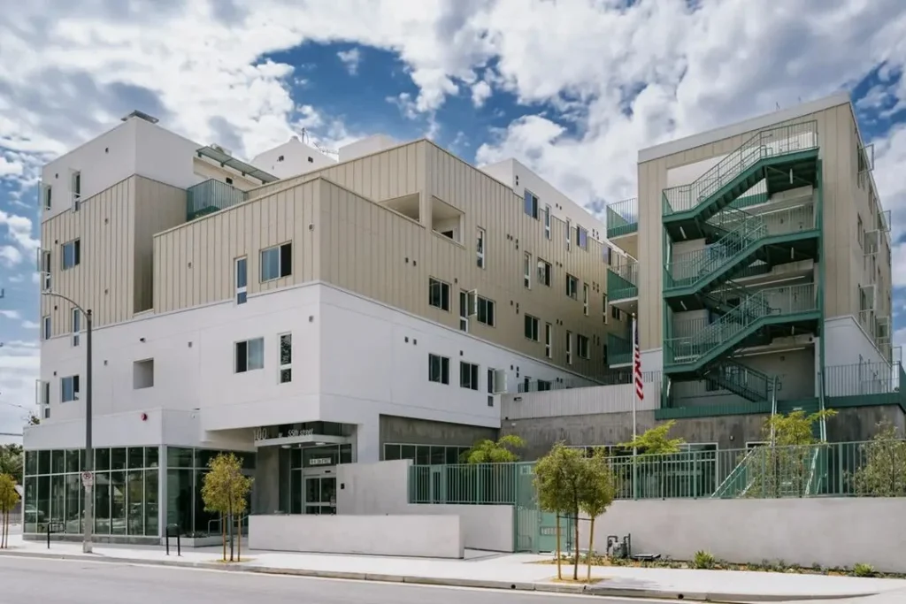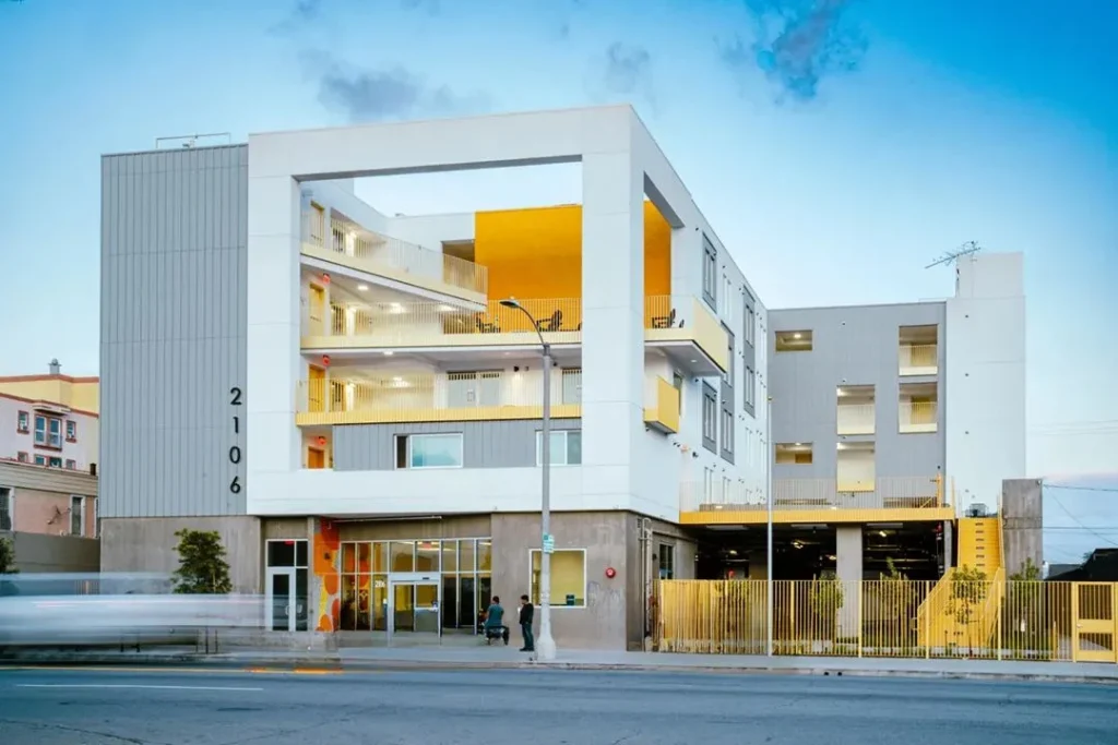

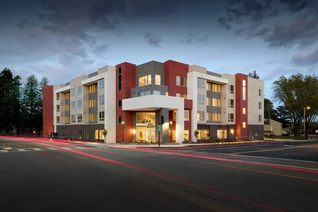
On paper, a family LIHTC project and a senior LIHTC project can look a lot alike. Similar budgets, similar compliance rules, similar unit counts. Walk into each one a year after opening, though, and you’ll see two completely different buildings in action.
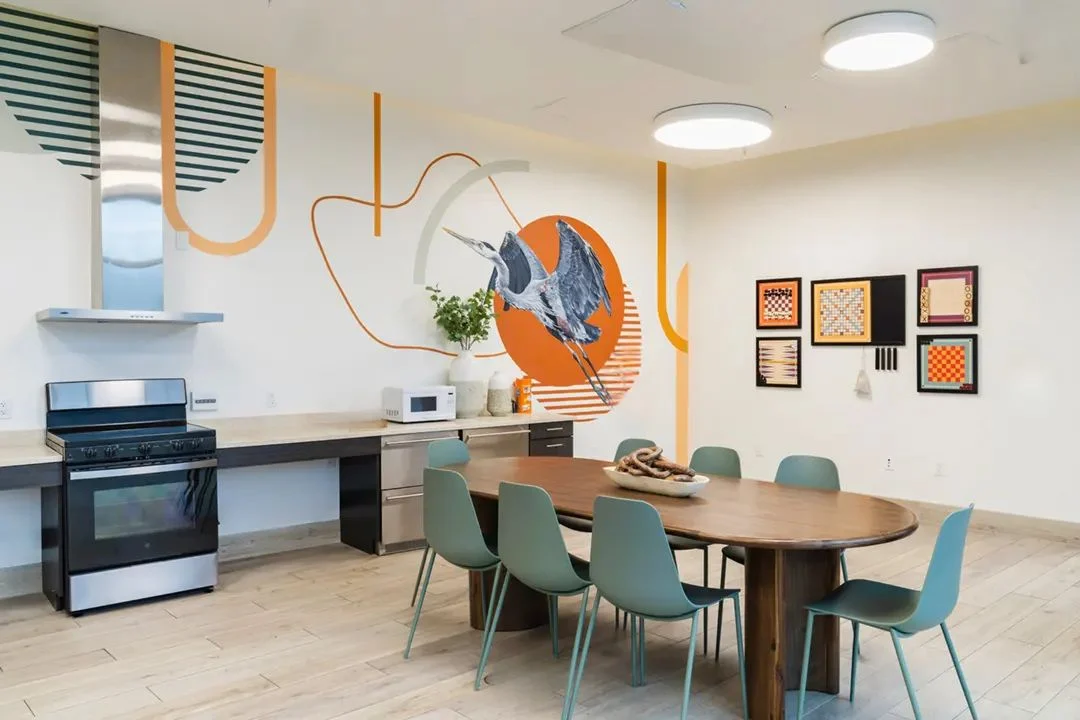
One has strollers in the lobby, backpacks on the homework tables and a community kitchen that smells like birthday cake. The other has a morning coffee group, a card game that has been running since opening day and residents who notice every change in the lighting.
Designing both well starts with a simple question: who lives here?
What family buildings need
Durability everywhere, not just in the corridors. Kids are wonderful and relentless. Spills, scooters and crayons are part of the plan. Choose finishes that clean easily and hide wear, and put wall protection where strollers and carts go.
Space for stuff. Stroller parking near the entry, cubbies in the community room and storage for toys and supplies. When things have a home, the building stays tidy.
Rooms parents can supervise from. A play area visible from the lounge or laundry lets parents relax while kids play. Glass doors and open sightlines help a lot.
A bigger community kitchen. Family buildings host more parties, more potlucks and more crowds. Size the island and seating for a real gathering.
Homework and study space. A bright room with sturdy tables and power at every seat will be full every afternoon.
What senior buildings need
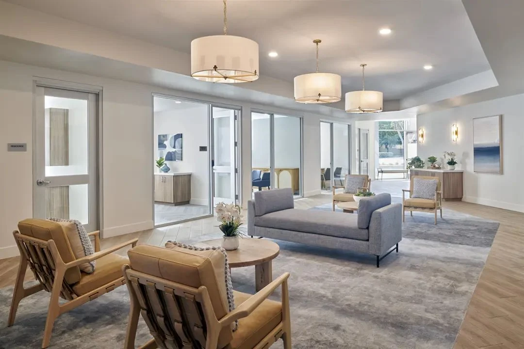
Light and contrast. Older eyes need more light and more contrast to read a room comfortably. Layer the lighting, avoid glare and let floors, walls and furniture contrast with each other.
Seating that helps people stand up. Firm cushions, seats at a comfortable height and sturdy arms to push up from. It’s the most important furniture decision in a senior building.
Calm patterns. Busy, high-contrast patterns on floors can confuse depth and feel unsteady underfoot. Choose quieter patterns in the paths people walk.
Gathering spots near the entry. Seniors often socialize close to the front door, the mailboxes and the activity board. Put comfortable seating where life already happens.
Handrails and grab bars that look like home. Wood-capped handrails and grab bars in finishes that match the hardware say “home,” not “hospital.”
Side by side
| Design decision | Family affordable | Senior affordable |
|---|---|---|
| Top priority | Durability and storage | Light, contrast and stability |
| Seating | Tough, cleanable, flexible | Firm, supportive, with arms |
| Flooring | Hides spills and wear | Calm patterns, smooth and glare-free |
| Community Room | Large, party-ready | Welcoming, easy to reach |
| Amenities | Homework room, play area, stroller parking | Activity room, library corner, shaded seating |
| Lighting | Bright and even | Brighter, warmer, glare-controlled |
What stays the same
Some things don’t change with the resident profile. Both buildings should feel like home, not a facility. Both need finishes chosen on lifecycle cost, because both will be in service for decades. And both benefit enormously from bringing interior design in early, while the walls can still move.
Families and seniors want the same thing from their building: a place that feels like theirs.
Mixed buildings
Some projects serve both or serve families today and aging residents tomorrow. In those buildings we lean on universal design: good contrast, levers instead of knobs, seating with arms mixed in with the rest, and flexible rooms that can shift from homework space to activity room as the community changes.
After 1,500 projects, we still love this part of the job. Figuring out who will live in a building is the most fun we have before the first sketch.