Watch a family walk into a model kitchen and count the hands. Somebody runs a palm across the island. Somebody taps the tile behind the range. Somebody takes a phone picture for a sister who isn’t on the tour. Counters and backsplash carry a lot of the kitchen’s personality for a modest share of its cost.
They also connect straight to revenue. Whatever slab and tile you put in the model is what buyers will ask for at the design studio, so the choices have to look good in person, read well on a phone and point to options a buyer can actually pick.
Quartz, stone and the stone looks
Quartz is still the favorite. A 2026 Zonda buyer survey presented at the International Builders’ Show found quartz leads countertops, and white leads cabinets. Buyers like the look of marble without worrying about a glass of lemonade left out overnight.
Within quartz, a few choices are worth making on purpose:
- Veined or quiet. A heavily veined slab is the star of the room. A quiet surface lets the backsplash, cabinets or lighting do the talking. A bold vein next to a busy tile starts an argument.
- Vein direction. On a waterfall island or slab backsplash, ask to see the fabricator’s layout before the slab is cut, so the veining looks intentional.
- Edge profile. An eased edge reads current. A mitered edge makes a standard slab look thick and substantial.
- Finish. Polished shows off the pattern. Honed or matte feels softer and more modern, but it shows fingerprints, which matters on a counter thousands of hands will touch.
If the design studio offers natural quartzite or marble as a top upgrade, show it in a small dose: on the island, with quartz on the perimeter. Buyers learn the option exists, and the standard package doesn’t look like a step down.
Slab backsplash or tile
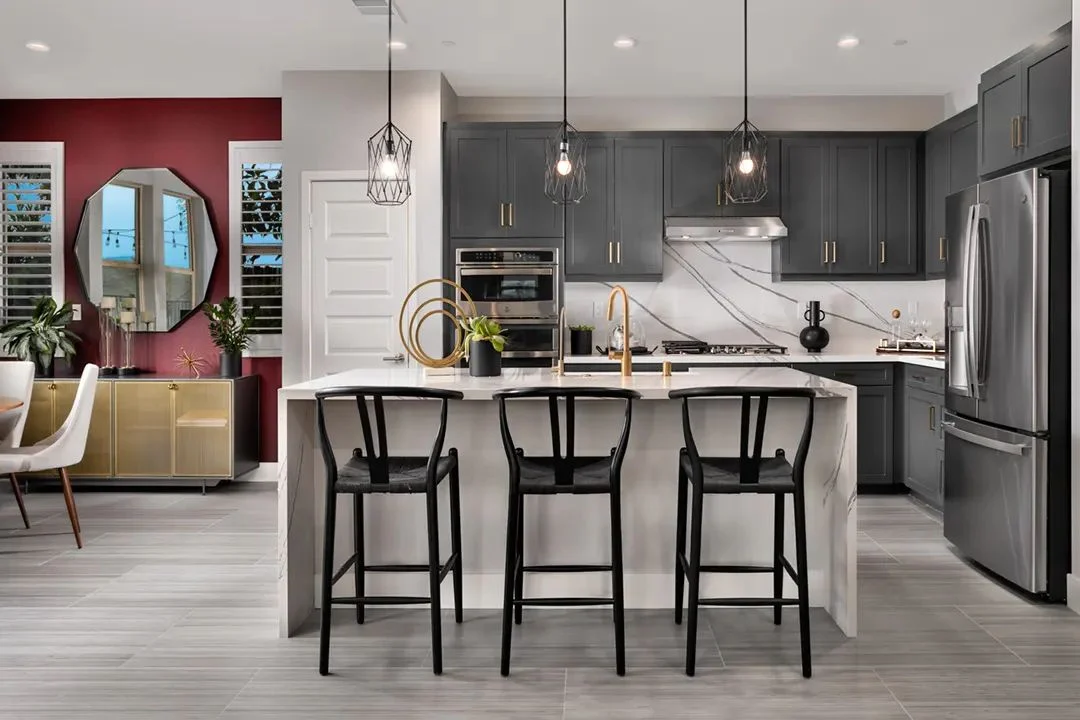
A full slab backsplash is calm, photographs beautifully and makes a kitchen feel custom. It also costs more, needs careful planning around outlets and seams, and works best when the counter has enough movement to be worth repeating up the wall. It often makes the most sense in the largest plan, or on the range wall only.
Tile gives you texture, pattern and more ways to vary the look between models:
| Backsplash approach | Where it works | Watch for |
|---|---|---|
| Full-height slab | Range wall in the largest plan, modern schemes | Outlet placement, seams, cost |
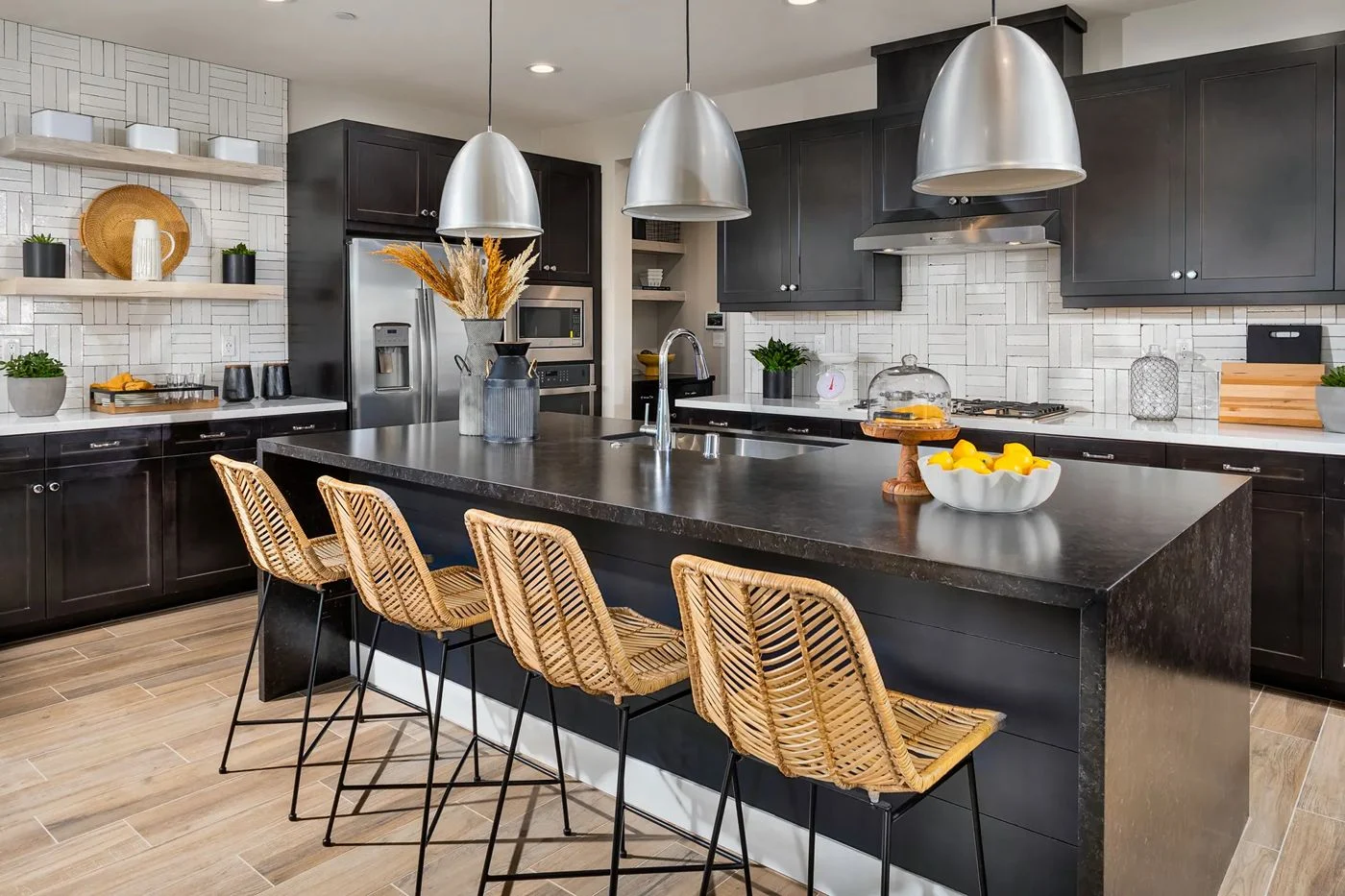
| Stacked or vertical tile | Warm modern, kitchens that need a little height | Layout must be precise; crooked lines show |
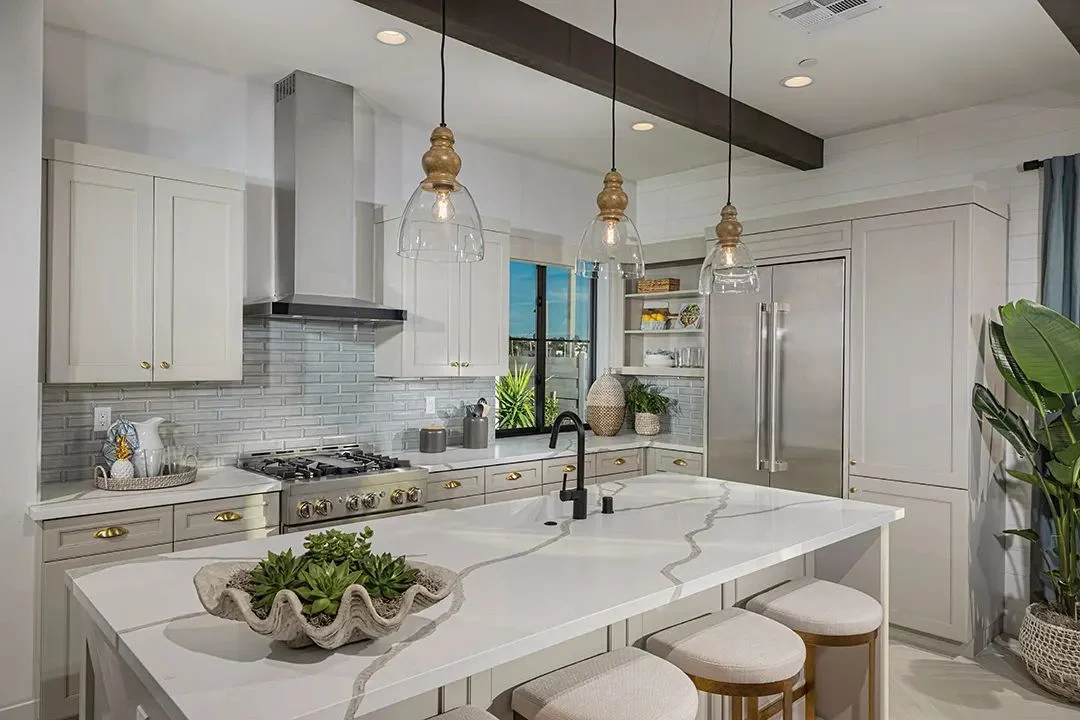
| Handmade or zellige look | Farmhouse, Spanish and coastal schemes | Can feel busy next to a veined counter |
| Offset subway | Entry plans and value packages | Reads basic without good grout and edges |
A stacked pattern in a straight grid reads clean and modern. Turn the same tile vertical and it pulls the eye up, so a standard ceiling feels a bit taller. Zellige-look tiles bring warmth through slight variations in glaze and edge, and porcelain or ceramic versions are usually easier to install than the handmade originals, which matters when a model has a grand opening date.
Grout is a design decision
Grout gets chosen last and noticed first. A grout that matches the tile makes the backsplash read as one quiet surface. A contrasting grout turns every joint into a line in a drawing. That can look great with a simple tile, and it also shows every uneven cut.
Very light grout near the range and sink tends to discolor. A grout a shade or two darker than the tile is more forgiving, and stain-resistant grout products are worth asking your installer about. A model kitchen has to look new for as long as the community is selling.
Pick one star in the kitchen. The counter, the backsplash or the lighting can carry the room, but not all three at once.
How far to run it
The short four-inch splash reads dated to most buyers now. Running tile to the underside of the upper cabinets is the usual baseline. The range wall is the place to go further, to the ceiling or the top of the hood, so it becomes a feature buyers see from the great room.
Where tile stops matters as much as where it starts. End it at a natural break: the side of a cabinet, an inside corner, a window casing, never mid-wall. When an edge has to show, use a finished edge piece or a slim metal profile.
Catalina’s own model home strategy for kitchens calls for layered materiality across cabinetry, backsplash and lighting, elevated without being overdesigned. In plain terms: the counter, tile and fixtures should look chosen together, and nothing should be shouting.
Styling the counters
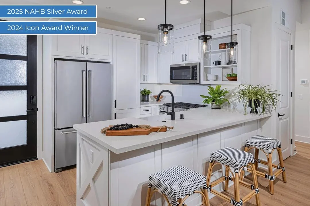
A model kitchen should look lived in by someone very tidy:
- A large wood cutting board leaning against the backsplash near the range
- A bowl of lemons or fruit, or a low plant
- A short stack of cookbooks
- A simple coffee setup tucked into one corner
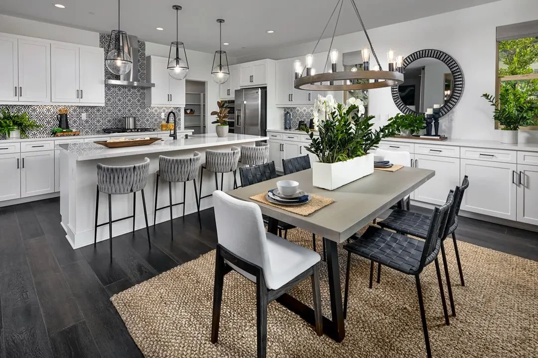
Group items in small clusters at the ends and corners, and keep the island mostly clear. Buyers want to put their hands on it and picture homework or Saturday pancakes.
What doesn’t belong: a row of small appliances, visible labels and fake food that looks fake from three feet away. A recent Builder magazine piece made the point that buyers usually see a model online first, and that too many accessories look cluttered in photos. Clear counters let the slab and tile do the selling.
Tie it to what the design studio sells
A model kitchen is a promise. Make sure the design studio can keep it.
- Name the selections. A tour sheet listing the counter and tile by option name saves buyers from describing them from memory.
- Match the samples. The studio should have the exact slab and tile on display, not a near cousin.
- Watch the slab backsplash. If the model shows one and the studio only offers tile, expect disappointed buyers.
- Show an attainable pairing. In the entry plan, show at least one combination from the standard or first upgrade level.
The short version
- Quartz still leads, so choose veining, edge and finish on purpose and let one surface be the star.
- Treat backsplash pattern, grout color and where the tile stops as design decisions, not afterthoughts.
- Keep counters lightly styled for photos and tie every selection to an option buyers can actually choose.
A good model kitchen makes buyers want to cook there before they’ve seen the bedrooms.
Our question for youWhich counter and backsplash combination do your buyers point to most at the design studio?