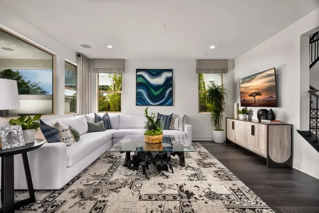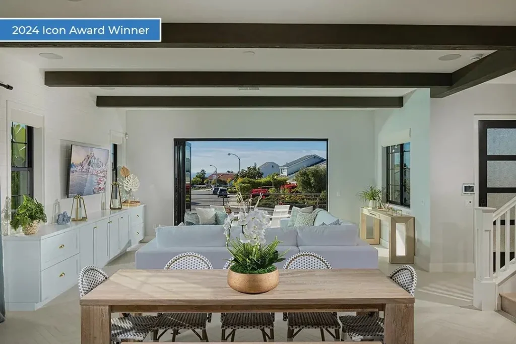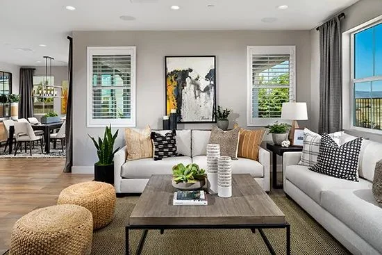
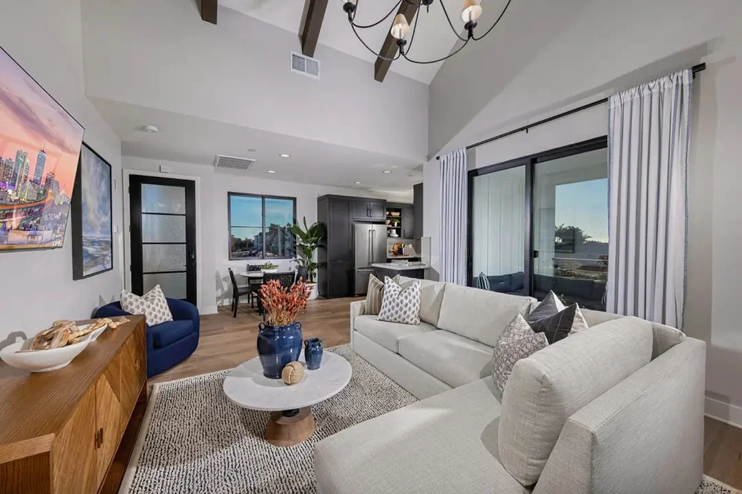
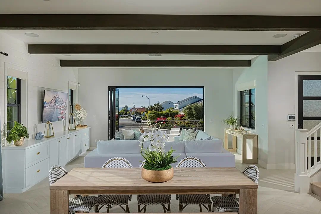
When people talk about a model’s color, they usually mean the walls. Buyers see a room: floors, cabinets, a sofa, a rug, a light fixture, the view out the slider. All of it carries color and adds up to one impression.
That impression forms fast. A Deep Brook Media and ECI presentation on the psychology of design put a buyer’s initial impression at about 95 seconds, and described the first level of reaction as visceral: color, light, smell. The palette is a big part of that first gut feeling.
An earlier article covered varying finishes across a plan series. This one is about how a single home’s color story gets built.
Paint is the last layer, not the first
It’s tempting to start with a paint chip. The better order runs the other way, from the things that are hardest to change to the easiest:
- Fixed finishes. Flooring, cabinets, counters, tile. These are the expensive decisions, and they set the temperature of the house.
- Large furnishings. Sofas, beds, dining tables, big rugs. They cover a lot of visual area.
- Wood tones and metals. The supporting cast that ties rooms together.
- Paint. Chosen to sit comfortably with everything above.
- Accents. Pillows, art, accessories, a throw. The easiest pieces to refresh.
Pick paint first and you end up matching the floor to the wall. Pick it last and it pulls everything together.
The 60-30-10 rule, adapted for a model
The old 60-30-10 guideline still works: about 60% of a room in a dominant color, 30% in a secondary color and 10% in an accent. In a model home, it helps to apply it across the whole house, not just one room.
- 60%: the base. Walls, floors and large upholstery. Usually warm neutrals, because the base has to welcome the widest range of buyers.
- 30%: the supporting tone. Wood, cabinetry, a secondary fabric, a large rug. This is where the home’s personality starts.
- 10%: the accent. One or two colors repeated in art, pillows, glassware or a single painted piece.
A recent Builder magazine piece noted that neutrals with deliberate accents photograph better. Deliberate is the key word: repeat the accent through the house so it reads as a choice.
The 2026 shift: warmer, browner, greener
Color direction has moved. 1stDibs’ 2026 designer survey, published in November 2025, found chocolate brown was the most-cited color at 33%, up from 17% in 2022. Cornflower blue followed at 31%, burgundy at 21% and pistachio at 20%. The same survey found tan has lost about two-thirds of its popularity since 2023, and white, slate gray and black slid into single digits.
The color-of-the-year picks landed in a similar place. NAHB’s roundup of 2026 selections included Sherwin-Williams Universal Khaki, Benjamin Moore Silhouette, Behr Hidden Gem, Dunn-Edwards Midnight Garden, Valspar Warm Eucalyptus, Glidden Warm Mahogany and Pantone Cloud Dancer. The common thread: warm neutrals, rich luxurious hues and sophisticated greens.
Furniture agrees. Houzz’s report from the spring 2026 High Point market pointed to interesting wood finishes such as oyster-cut oak and olive-stained burl, and to vibrant warm blues moving away from navy.
What that means for a model:
- Warm the base. Swap cool grays for warm whites and warmer neutrals.
- Bring in brown through wood and leather before reaching for brown paint. It’s the easiest way to add depth.
- Use greens and warm blues as the accent. They feel current and they get along with natural light.
A word of caution. A 2026 Zonda buyer survey found about 54% of buyers prefer modern or somewhat modern interiors, and that white cabinets and quartz countertops still lead. Buyers aren’t asking for a brown kitchen. Keep fixed finishes broadly appealing and let richer color live in furniture, wood and art.
Put the trend in the throw pillows, not the countertops.
Tie the palette to the architecture and the place
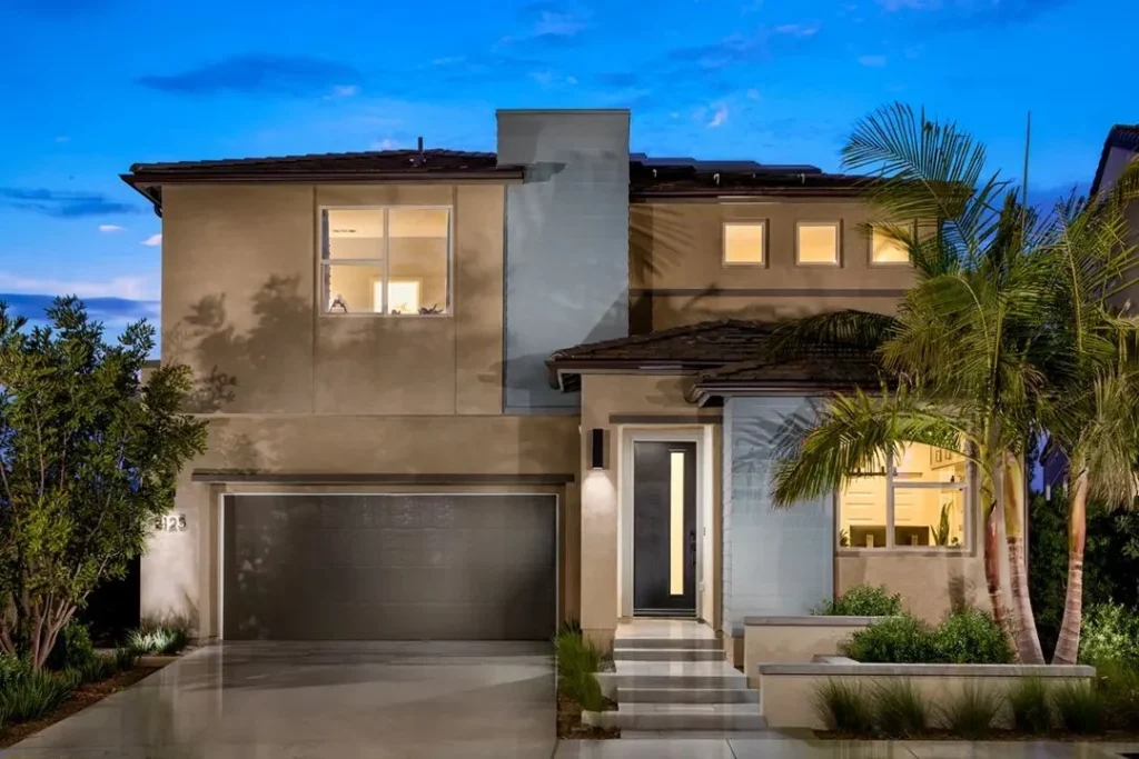
A palette that works in a coastal model can look strange in a desert one. The architecture and location should lead, and the target buyer should confirm.
| Style and setting | Base | Wood and metal | Accent ideas |
|---|---|---|---|
| Coastal | Soft warm whites, sand | Light oak, weathered finishes, brushed nickel | Warm blues, sea-glass greens |
| Desert | Warm clay, stone, warm white | Mid-tone and rustic woods, black iron | Terracotta, sage, ochre |
| Spanish | Creamy plaster whites | Dark-stained wood, wrought iron, aged brass | Deep greens, burgundy, tile colors |
| Modern farmhouse | Warm white, light greige | Natural oak, matte black, aged bronze | Olive, muted blue, warm brown |
Treat the table as a starting point. The real test is the actual home and the buyer it’s built for.
Metals and wood tones: mix with a plan
Mixing metals and woods is normal now. Mixing them without a plan is how a room ends up looking like a closeout sale.
- Pick one lead metal per home and repeat it in lighting and hardware. Let a second metal play support.
- Pick one dominant wood tone, then add one or two others that are clearly lighter or darker. Woods that are almost the same just look mismatched.
- Watch the undertones. A warm oak floor next to a cool, gray-washed table rarely gets along.
Fabrics carry color quietly
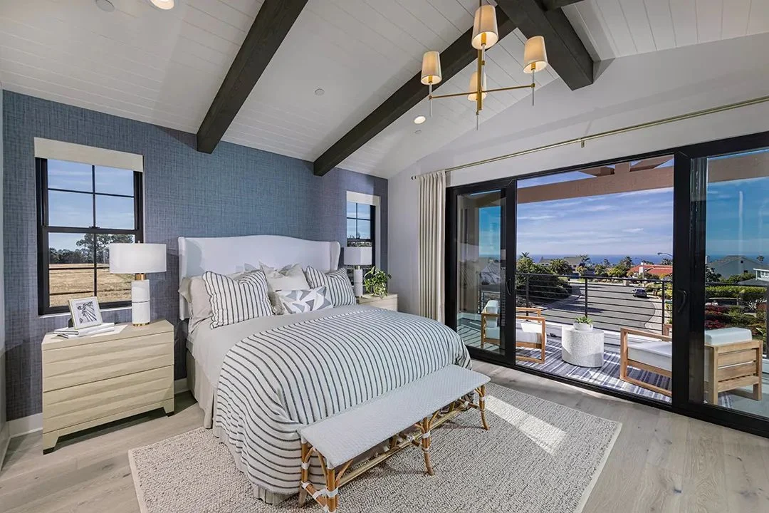
Textiles make a palette softer and richer: a warm oatmeal sofa, a rug that picks up the wood tone, drapery a shade deeper than the wall. Layer texture as much as color: bouclé, linen-look weaves, a heavier woven basket. Texture adds depth without adding another color to the count.
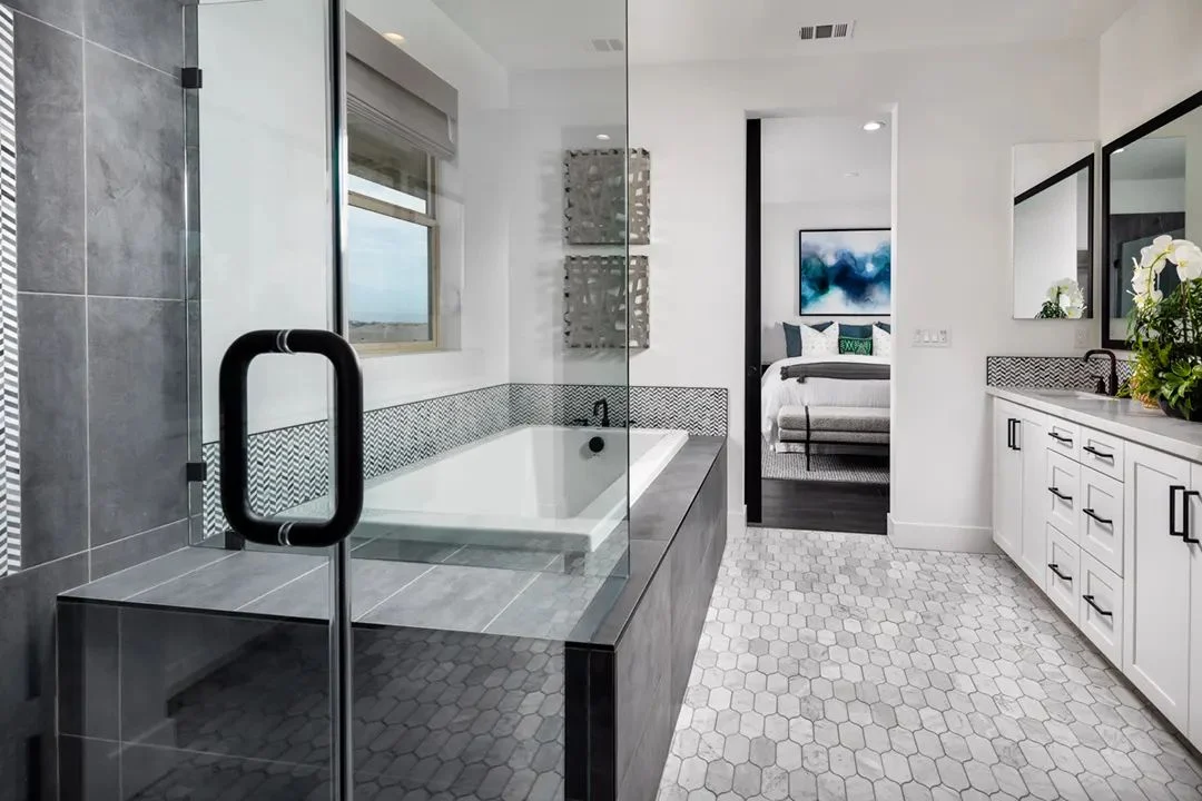
In the primary suite, warm, calming colors and soft layers help it feel like a retreat. Hospitality-inspired layering works because it leans on texture, not loud color. The primary bath should share the bedroom’s palette so the suite reads as one place.
Check it in the real light
West Coast light is strong, and a warm white that looks perfect on a sample board can turn yellow by late afternoon. Approve the palette in the home itself, at more than one time of day, before final orders go out.
The short version
- Build the palette from the hardest-to-change finishes to the easiest, and pick paint last.
- Use 60-30-10 across the whole house, and bring in 2026’s warmer browns, greens and warm blues through furniture, wood and accents.
- Let the architecture and location set the direction, and approve the palette in the real light.
When the palette is right, buyers rarely mention color at all. They just say the house feels good.
Our question for youWhich color are your buyers reacting to most in the models right now?